Trackmania Singapore Graphics
Year: 2025
Role: Lead Designer
Created in: Figma
Skills Used: Graphic Design, Copywriting, Iterative Design, Branding
Project Overview
Designed the official logo and promotional graphics for the Trackmania Singapore gaming community, creating a bold billboard-style visual identity capturing the energy of competitive racing within a shared community.
Design Development
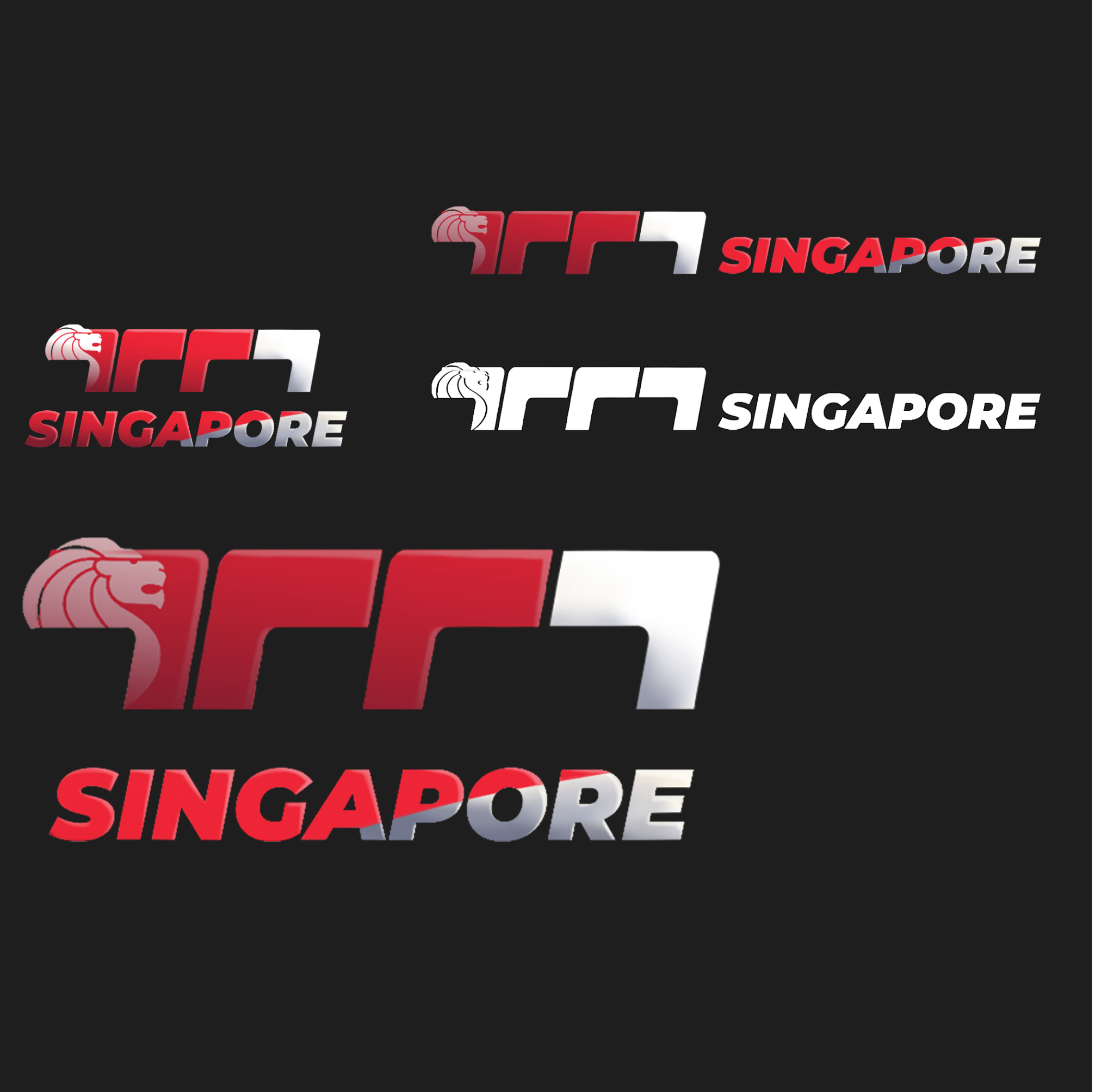
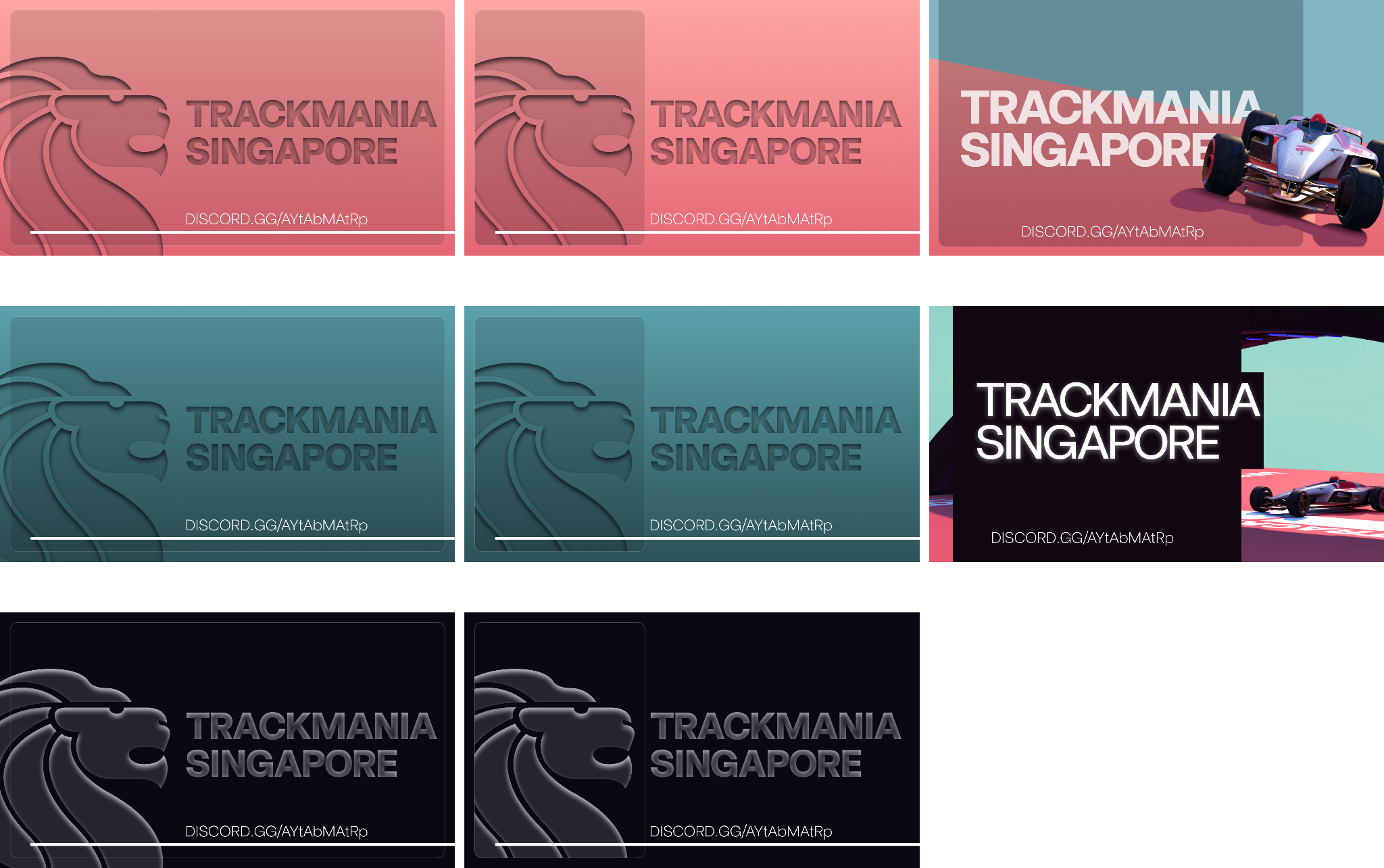
Logo variations (Default, Black/White, Square)
Draft designs explored different Singaporean motifs while ensuring that the base text would be legible even at smaller sizes. Logo variations were provided to scale according to client needs.
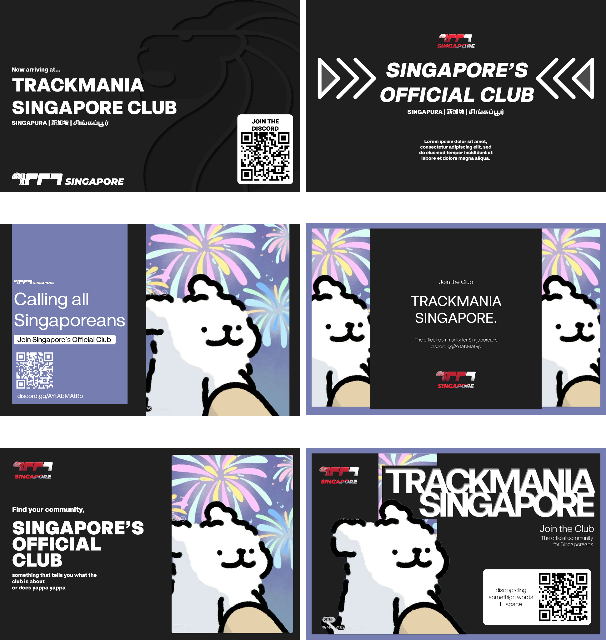
Initial banner mockups
The banners focused on incorporating different styles and layouts to get a feel for what worked best. Copywriting was also used here to test variations for best impact and legibility, even at smaller sizes. The bottom right version, with a cutout overlay, stood out most to me, as would be seen in further iterations of the ideas.
Refinement
Selected designs were then expanded on for further polishing before showcase to the client.
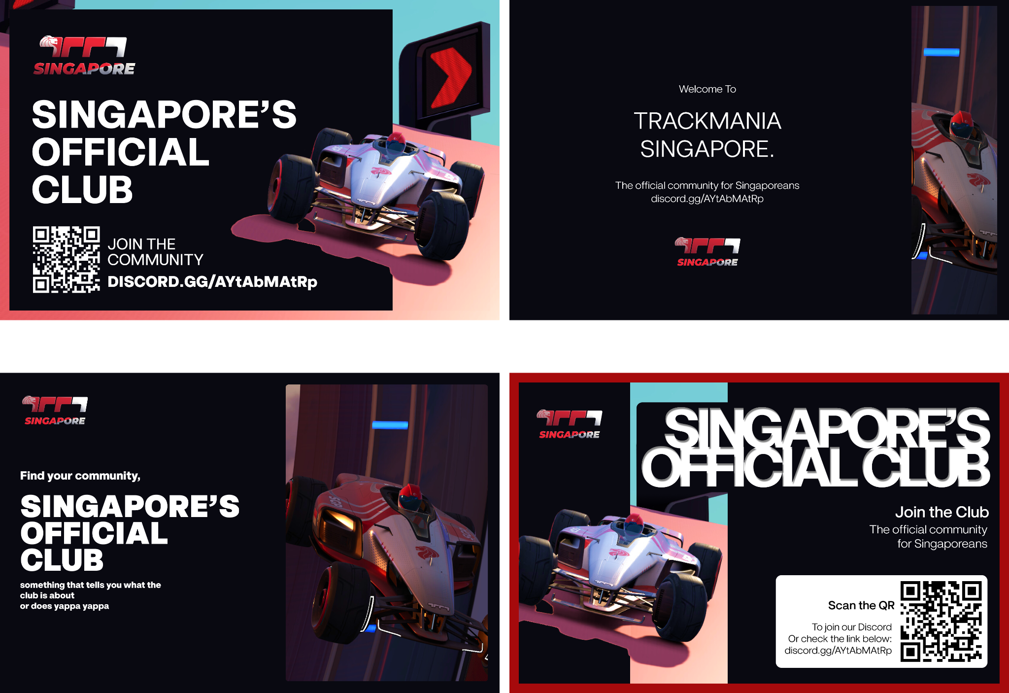
Refined designs integrated design elements from mockups. Colours and copywriting chosen targeted a lively yet professional feel.
Done in Figma meant that I could easily replace and shift elements within the designs. I combined the elements from previous designs that stood out to me most, and refined them to closely match the visual assets provided.
Expanding on Ideas
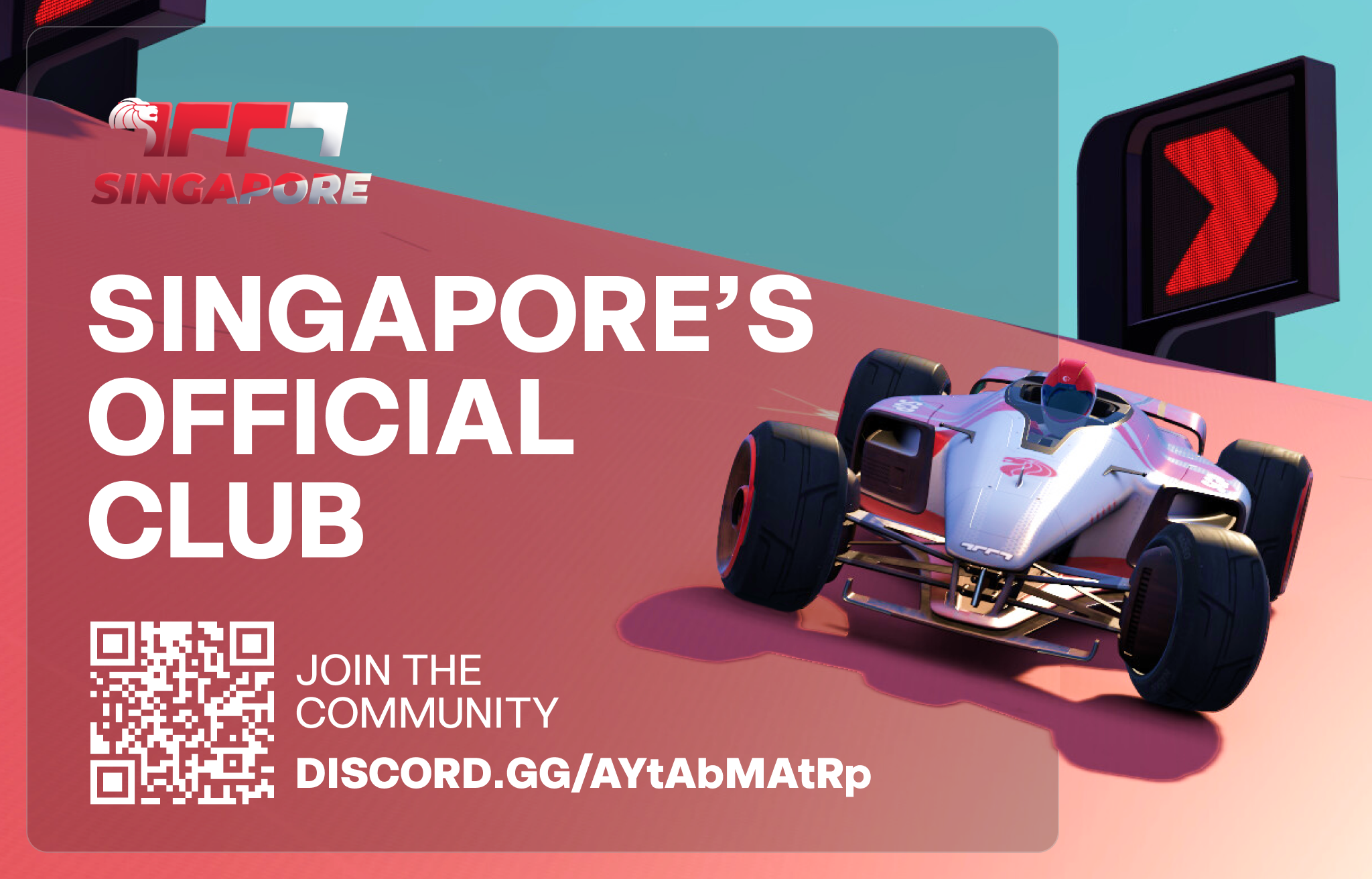
After an initial viewing by the client, the designs were revised according to feedback and requirements. The final banner set required three working sizes of each design, which were smaller versions based on the initial main billboard, made to be consolidated informational.
Three designs were presented to the client, for review and final changes.
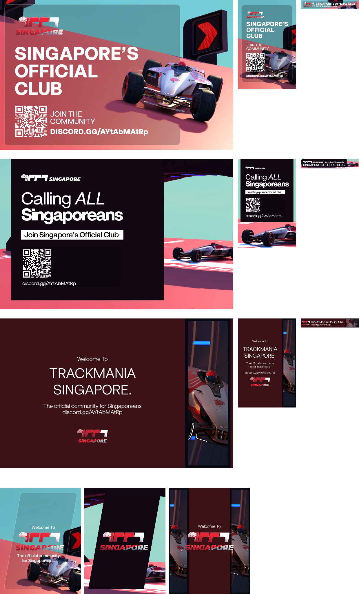
Three billboard designs in three size variations alongside a vertical welcome banner.
Additional screens designed for background images in the game. Specific care was taken here to have the image non-intrusive and adherent to safe spaces provided for key UI elements.
Key Takeaways
The final designs were presented to the client for their usage, and appropriate relevant assets also provided during handoff.
This project allowed me to explore the usage of different design elements and heuristics, such as hierarchy and copywriting. The creation of three visually distinct yet standardized choices allowed for exploration of different interpretations for the community, while maintaining the same styling and new brand identity. I also learnt how to better communicate and present work during different stages of completion to clients for a more efficient and hassle-free process.
Post a comment